SF HEP B FREE
Role
Timeline
Deliverable
Tools

OVERVIEW
SF Hep B Free hired me for a website overhaul
Problem
SF Hep B Free hadn’t updated their website in 7 years, which left them with a website design that looked outdated. Their website content was regularly updated by interns, but without a design system to follow, each intern made updates in their own style.
Goals
SF Hep B Free is a non-profit organization that aims to bring hepatitis B education, awareness, and care to San Francisco Bay Area communities. They wanted this website to be able to:
⟶ Increase traffic to their website
⟶ Increase donations to grow their services
⟶ Increase hepatitis B education and awareness
DISCOVERY
I reviewed their website analytics
I wanted to get a clearer picture of the website’s current performance and user behavior. The numbers told an important story — 77% of users were leaving almost as soon as they arrived, which is higher than the benchmark for non-profit websites. On top of that, more than half of the visitors landed on the homepage, and 64% of them left without going any further.

SF Hep B Free's bounce rate is at 77%, while the benchmark bounce rates for non-profit websites and websites in general are 60% and 40%, respectively.
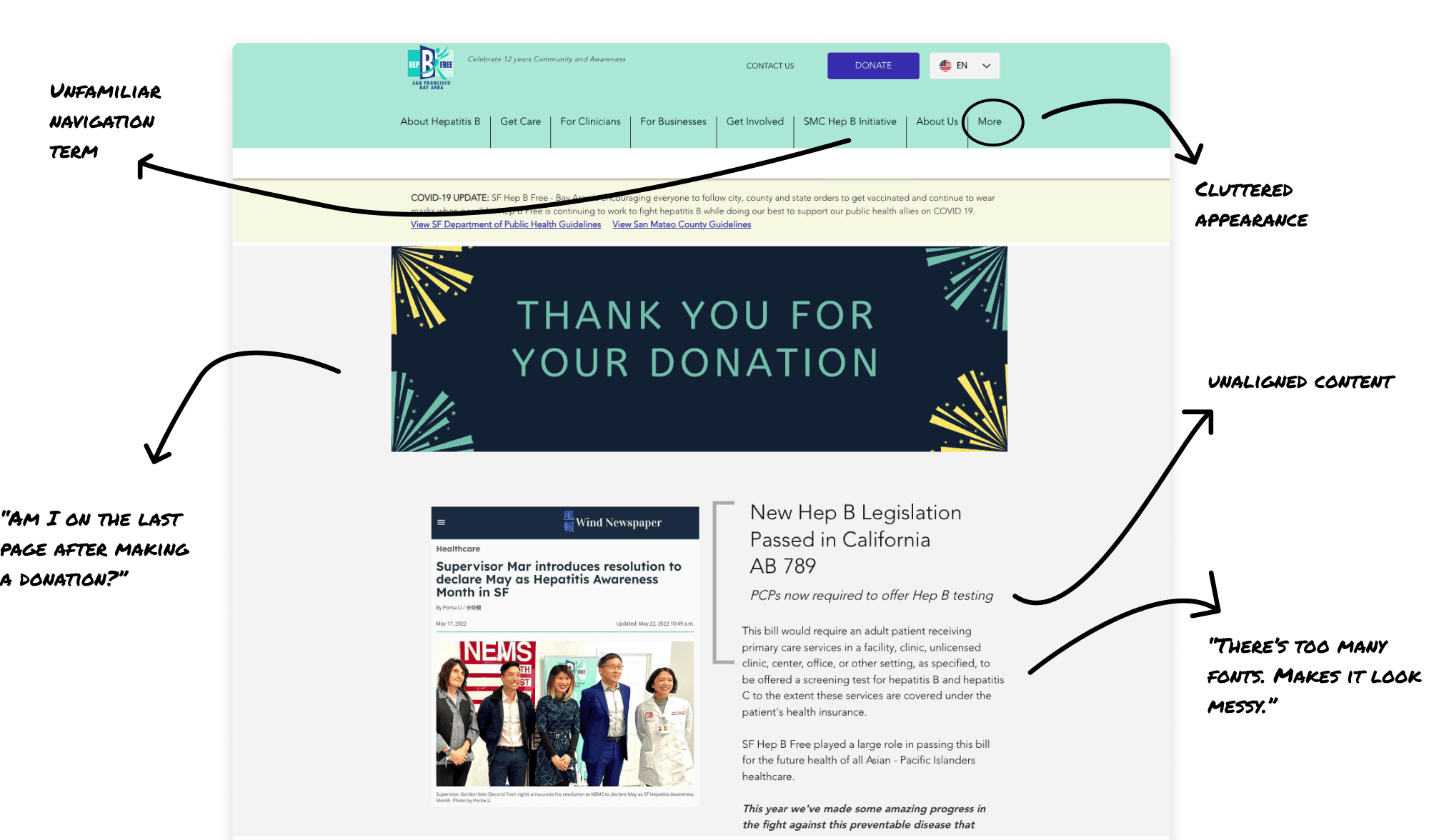
Cluttered and confusing
The analytics were a clear red flag, signaling that something fundamental about the site wasn’t working. This pushed me to run an website audit and sitemap analysis to see what might be contributing to the poor performance. I found several key issues:
Walls of text that make it difficult for users to digest information
The homepage doesn't feel like a landing page, rather it looks like a random page on the site
There are too many menu tabs that it overflows into a "More" section
The information hierarchy isn't consistent from one section to another
Inconsistent navigation behavior and page labels
Engaging with the target audience
The findings suggested that users were likely getting frustrated or confused, which could explain why so many visitors were leaving the site almost immediately.
I decided to run a user test because I wanted to see how real users were interacting with the website and validate the issues I had identified. Analytics and audits can reveal what is happening, but user testing uncovers why it’s happening by allowing users to navigate the site in real time.
Health fairs provide an opportunity for SF Hep B Free to engage directly with their target audience—elder Asian Americans. Leveraging these events, I conducted exploratory testing of the website to assess its effectiveness in educating and promoting the organization.
What I kept hearing👂
"So what do they do?"
The company's mission and offerings were unclear.
"Seems like the info here could be old."
Even though SF Hep B Free takes measures to ensure all their site content stays up-to-date, users didn't trust the information to be relevant.
DESIGN PRINCIPLE
How can we redesign this website in a way that builds confidence and brings clarity to the user? 🤔
🔍
Uncover the Cause
Paint a picture of SF Hep B Free's mission and make their services easily discoverable to visitors.
🤝
Inspire Trust & Confidence
Maintain consistency in visual elements and adopt clean, modern design trends.
🧠
Call on Familiar Frameworks
Understand user's mental models and develop logical structure in layouts and navigation.
👥
Craft Collaborative Solutions
Develop clear, user-friendly, scalable designs that can be followed and implemented by all skill levels.
Ideating and iterating for optimal results
Focusing on these principles, I brainstormed website solutions, weighing pros and cons with my client to iterate and refine the best fit for project goals and user needs. Here are some ideas we explored:


DESIGN RESULTS
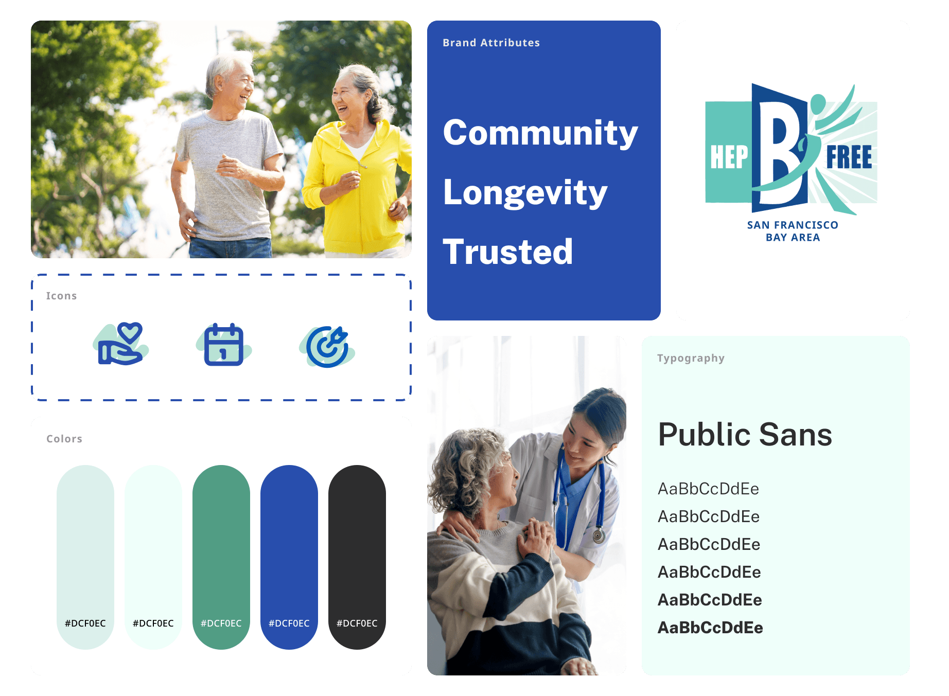
Branding
1 Branding
Target
Brand identity, User trust
Solution
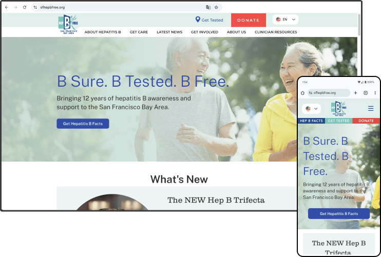
SF Hep B Free is a grass roots, boots-on-the-ground organization whose main demographic is Asian American immigrants. Building off of their identity, the new brand is rooted in the community, is trusted and reliable, and promotes healthy living and longevity.
2 Information Hierarchy
Target
User flow, Navigation, Scannability
Solution
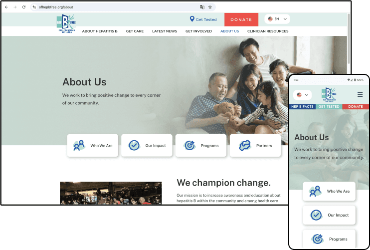
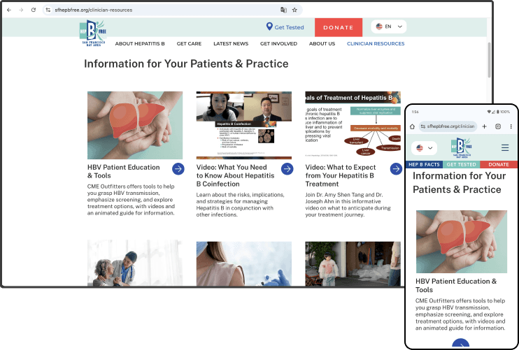
I conducted a card sorting exercise with users and referenced the results to reorganize the sitemap to be user-logical and followed consistent navigational behavior. The use of mixed fonts and text sizes weighs on mental effort. I built a typography style guide for site-wide use creating predictability in structure and layout.

3 Content Strategy
Target
Solution
I dissected pages with condensed walls of text and broke them up into consummable sections using a mix of text labels and media. I created graphics to make the content more digestible.
IMPACT
Improved Metrics
Bounce Rate
The bounce rate came down from 77% to 57% bringing us under the benchmark for non-profit websites! The 20% improvement was attributed to an improved site structure, clarity in functionality, and visual design that inspires confidence.
User Engagement
Interactions with the donation page jumped up by 200%, demonstrating the effectiveness of the redesigned navigation and user journey.